
What is negative space in interior design?

The instinct when designing a room is to fill it. More furniture, more art, more objects. But the rooms that hold your attention longest usually have more restraint than they have stuff. Negative space is the design principle behind that restraint. Understanding it changes how you read a room and how you build one.
What negative space means in interior design
Negative space is the unoccupied area of a room: the wall between two pieces of art, the floor visible around a rug, the gap between a shelf and its objects, the air above a low piece of furniture. In design terminology, it is also called breathing room, though that phrase does not quite capture what it actually does.
Negative space is not absence. It is form. It shapes the objects around it. It gives them room to exist as distinct things rather than blending into a visual mass. Without negative space, a room reads as crowded even when every individual object is well chosen.
In two-dimensional design, the concept is easier to see. The white space around text on a page is not emptiness. It is what makes the text readable. Interior design works by the same logic. The floor visible around a sofa defines the sofa's shape. The wall visible around a painting defines the painting's presence.

Why negative space is not the same as minimalism
This is worth clarifying because the two concepts are frequently conflated. Minimalism is a style. Negative space is a principle. You can have negative space in a maximalist room and almost none in a spare one.
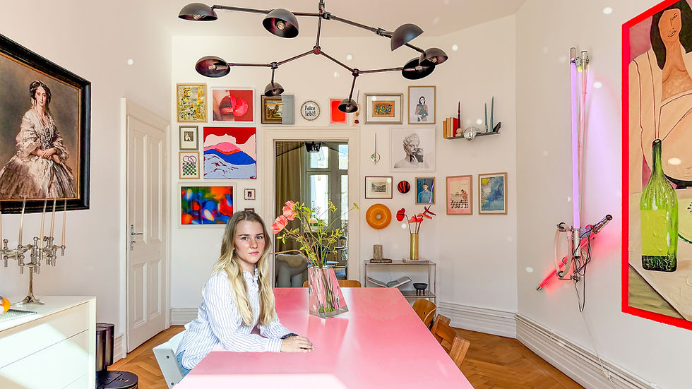
A room with many objects, rich textures, and warm colors can use negative space well if there are clear breaks between elements, surfaces that rest the eye, and areas that are deliberately left empty. A minimal room can fail to use negative space if every surface is used, every wall is covered, and there is no clear visual pause.
The distinction matters because many people believe that adding negative space means removing things they love. That is not necessarily true. It means being intentional about where the eye is directed to rest.

How negative space functions in a room
Negative space does three things in an interior.
First, it creates emphasis. An object on a full shelf disappears. The same object on a shelf with space around it becomes a focal point. Negative space is directional. It tells the eye where to look.
Second, it creates rhythm. A room where every surface is occupied at the same density reads as noise. A room where occupied and unoccupied areas alternate has rhythm. The eye moves through it rather than stopping at the entrance.
Third, it communicates intention. A room with considered negative space reads as designed, even if the individual objects in it are simple. The spaces between things make the things visible. This is why furniture showrooms are styled with so much floor space around each piece. The space is doing the selling.

How to use negative space in practice
The most effective way to start is not by removing objects. It is by identifying where the eye wants to rest and protecting those areas.
Stand at the entrance to the room you are working on. Where does your eye go? That is likely a primary focal point: a window, a large piece of furniture, a fireplace. The areas immediately around it should have less visual density, not more. The space near a focal point amplifies it. Crowding that space dilutes it.
On shelves, leave 20 to 30 percent of the visible surface empty. This is a rough guideline, not a rule, but it prevents the default of filling every inch. The empty areas are not wasted space. They are structure.
On walls, treat the space between artworks as part of the composition. Two pieces with a long gap between them are three elements: the first piece, the space, and the second piece. Size the gap with the same intention as the pieces.
For more structured guidance on reading and planning space, the Interior Workbook walks through layout principles including proportion, focal points, and spatial balance.

What negative space is not
Negative space does not mean empty rooms. It does not mean a sofa in the center of a room with nothing else. It does not mean a curated aesthetic of barely anything.
A room can be full, layered, and deeply personal while still using negative space well. The key is visual breaks: moments in the room where the eye can pause before moving to the next point of interest.
The opposite of negative space is not richness. It is noise. Richness is when everything in a room is chosen carefully and arranged with intention. Noise is when there is no hierarchy, no pause, and no direction for the eye to follow.
Frequently asked questions
What is negative space in interior design?
Negative space is the unoccupied area of a room: empty wall, visible floor, air around objects. It gives the objects in the room room to be seen distinctly. Without it, a room reads as visually crowded regardless of how well each individual piece is chosen.
How do I create negative space in a small room?
In a small room, negative space is even more important because the tendency is to fill every surface. The most effective approach is vertical restraint: leave wall space above furniture empty, keep shelves partially clear, and let the floor appear in as many places as possible. Space around objects makes a small room read as larger than it is.
Is negative space the same as minimalism?
No. Minimalism is a style defined by few objects, simple forms, and often cool or neutral palettes. Negative space is a design principle that works in any style. A maximalist room can use negative space well. A minimal room can fail to use it if every surface is covered at the same visual density.
How much negative space is right for a room?
There is no precise answer. A useful guideline for shelves is to leave 20 to 30 percent of the visible surface empty. For walls, the space between pieces of art should be treated as part of the composition. The practical test is to stand at the entrance and ask where the eye wants to rest. If it cannot find a resting point, there is not enough negative space.
Why do some rooms feel overcrowded even when they are not full?
Usually because the visual density is uniform. When every surface and every area of a room carries the same amount of visual information, there is no hierarchy and no rhythm. The eye reads this as crowded even if the room is not technically full. Breaking that uniformity with areas of intentional emptiness immediately makes the room feel more spacious.
Negative space is not restraint for its own sake. It is the structure that makes everything else in a room readable. The art becomes visible because of the wall around it. The furniture has presence because of the floor around it. The room makes sense because there are places within it where it pauses.


Comments