
How to layer colors in a living room without it looking chaotic

Most living rooms don't fail because someone chose a bad color. They fail because three or four good colors got introduced with no plan for how they'd relate to each other. The room ends up loud, not layered. Layering is not about adding more colors. It's about giving each one a job.
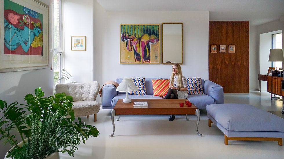
What layering actually means in a living room & How to layer colors
Color layering is the practice of building a room's palette in deliberate stages, the way you'd build an outfit rather than dump every piece on the bed at once. There's a base, a supporting layer, and an accent layer. Each one has a different job and a different proportion of the room.
If you want already layered color combinations, the Curated Color Palettes consists of 54 selected interior palettes, so you're choosing from combinations that already have the hierarchy worked out.

The base sets the temperature of the space. Walls, large upholstery, flooring. This is usually 60 to 70 percent of what your eye registers. The supporting layer, things like curtains, a rug, a secondary sofa or chair, carries the next largest share. The accent layer is small and loud on purpose: pillows, art, a vase, a single bold chair.
When a room feels chaotic, it's almost always because two colors are competing for the same job. Two accents fighting for attention. A base color that's too saturated to actually recede.
If youre looking for more Color Inspirations, you can check out the Interior Color Palettes.

Why the 60-30-10 framework works (and where it breaks down)
So how do you layer colors in a living room without it looking chaotic?
You've probably seen the 60-30-10 rule: 60 percent dominant color, 30 percent secondary, 10 percent accent. It's a useful starting ratio because it forces hierarchy onto a space that would otherwise default to visual noise.
But the rule assumes three colors. Most living rooms end up with five or six once you count the rug, the art, the plants, the throw blanket, and whatever wood tones are already in the room. The ratio still applies. You just have to group your colors into three tiers instead of counting them as three individual choices.
Put every color in the room into one of three buckets: dominant, supporting, accent. If a bucket has more than two or three colors in it, that's usually where the chaos is coming from.
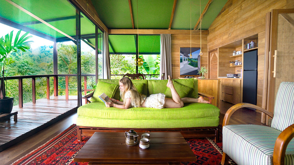
How to choose which colors go in each layer
Start with what you can't change. Flooring, built-in cabinetry, a large existing sofa. That's your base layer whether you planned it that way or not, and it should stay the least saturated color in the room.
Your supporting layer is where you introduce personality. This is the rug, curtains, and one or two large furniture pieces. I've found that the supporting layer works best when it pulls from the same color family as the base but shifts either warmer, cooler, or a shade or two deeper. Not a matching color. A related one.
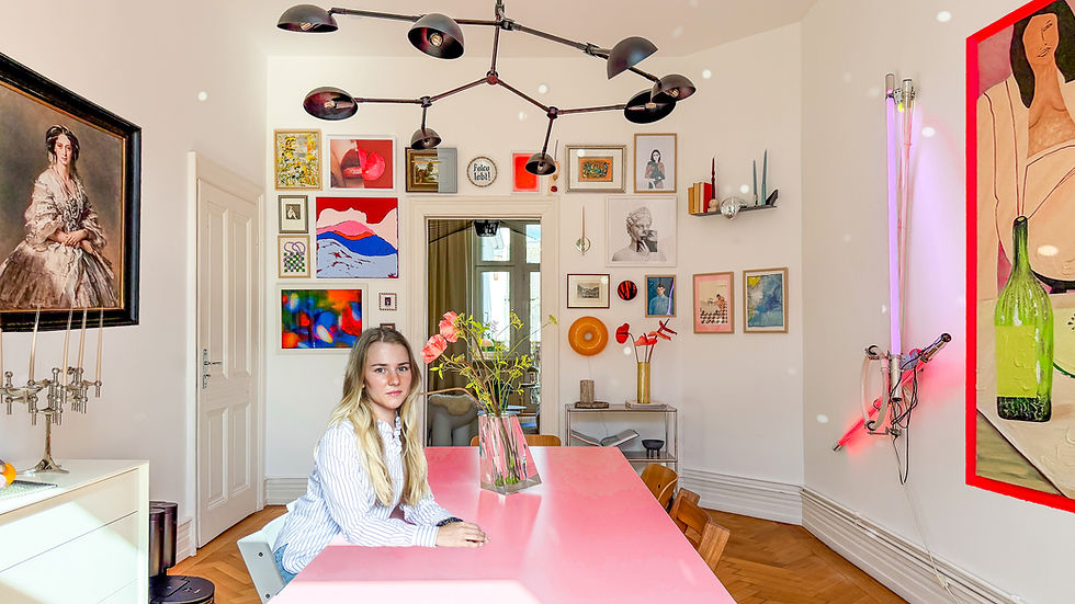
The accent layer is the only place true contrast belongs. This is where you can bring in a color that has nothing to do with the rest of the room, because it's contained to a small enough area that it reads as intentional rather than random.
A common mistake: treating two or three accent colors as equally important. Pick one accent color as the lead and let the others act as its supporting cast in smaller doses.
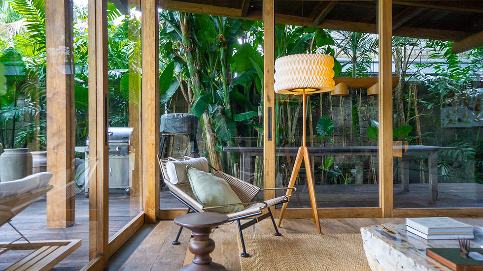
A practical way to test your layering before you commit
Photograph the room, then convert the photo to grayscale on your phone. This strips away hue and leaves you with only value, meaning how light or dark each element is. If your eye can't tell where the base ends and the accent begins in the grayscale version, your layering has a value problem, not a color problem.

If you want a structured way to test combinations before buying anything, the Curated Color Palettes collection is built around this exact base, supporting, and accent structure, so you're choosing from combinations that already have the hierarchy worked out.
Bringing it together in your own room
Layering color is less about taste and more about sequencing. Choose your base first and commit to it fully. Add the supporting layer only after the base is settled, not at the same time. Save the accent for last, and resist the urge to let it multiply.
A living room with three well-sequenced colors will almost always read as more sophisticated than one with six colors introduced all at once. Restraint is not a lack of personality. It's what lets personality show up clearly.
If you want to go deeper into how color decisions interact with proportion, lighting, and the rest of a room's design logic, the Interior Color Masterclass walks through the full process, not just the palette.
Frequently asked questions
How many colors should be in a living room?
Most cohesive living rooms work with three to five colors total, organized into a dominant base, a supporting layer, and one accent. More than that tends to require very careful value control to avoid looking chaotic.
What is the 60-30-10 rule in interior design?
It's a ratio for distributing color: 60 percent dominant, 30 percent secondary, 10 percent accent. It gives a room visual hierarchy instead of treating every color as equally important.
How do you mix colors in a living room without it looking busy?
Group your colors into three tiers by role, not by how much you like each one. Keep the base the least saturated, let the supporting layer relate to the base rather than contrast it, and reserve real contrast for a single accent color.
Should curtains match the wall color or the furniture?
Curtains generally work best in the supporting layer, related to the base color but not identical to it. Matching them exactly to the wall can flatten the room, while matching them to an accent can make them feel too loud for how much visual space curtains occupy.
What colors go together in a living room?
There's no fixed list. What matters more is whether your chosen colors have distinct enough values to separate into base, supporting, and accent roles. Two colors from the same family with different intensities will layer more successfully than two unrelated bright colors of similar intensity.
Layering isn't a formula you apply once. It's a habit of asking, for every new item you bring into a room, which layer it belongs to and whether that layer already has enough going on.

Comments